

Schumacher Wallpaper Pattern Guide: Iconic Prints, Best Rooms, and What to Expect on Price
Schumacher wallpaper is one of the fastest ways to make a room look "designed," not just decorated. The brand has been a trade staple since 1889, and the reason designers keep specifying it is simple: the patterns are memorable, the color is thoughtful, and the materials range from crisp printed papers to tactile grasscloths that make flat walls feel alive.
If you're researching Schumacher wallpaper patterns, you're already in the high-consideration category. These are statement wallcoverings with repeats, dye lots, and real installation planning. Done right, they outlast paint trends and make even new construction feel collected.
Key Takeaways
- Start with pattern family (chinoiserie, toile, botanical, texture) and scale--then pick a colorway that supports your furnishings.
- Schumacher's archive is deep (over 2,000 wallpaper patterns are referenced in coverage of the brand's library), so narrowing by "room job" is smarter than scrolling endlessly.
- Chiang Mai Dragon, Cloud Toile, and Citrus Garden are iconic because they're flexible: they work in both maximal rooms and restrained ones when the palette is controlled.
- Textured wallcoverings (linen, grasscloth, sisal) bring warmth and dimension, but they're not the best choice for splash zones or scuff-prone hallways.
- Expect Schumacher wallpaper price to sit in the premium/luxury tier; plan for samples, extra yardage for repeat matching, and professional installation.
- If you want access without a trade account, shop through an authorized retailer who can help you get the right paper, the right quantity, and the right guidance.
Schumacher wallpaper, explained (and why trade brands feel different)
Schumacher has always operated like a designer's toolbox: wallpaper, Schumacher fabric, trim, and more, all meant to coordinate in real rooms, not just on a product page. That trade-first DNA shows up in the details--layered color, complex linework, and patterns that look better the longer you live with them. On its own site, the brand positions itself as a broad design resource spanning wallpaper, fabric, trim, pillows, accessories, and furniture (Schumacher's official site).
It also shows up in how you shop. Schumacher is widely specified through the design trade, and many patterns are easiest to access through authorized retailers. For homeowners, that matters because it removes the "I found it, now how do I actually buy it?" problem. It also helps you avoid the most expensive wallpaper mistake: under-ordering because you didn't account for repeat, matching, and waste around doors, windows, and outlets.
Design coverage around Schumacher's wallpaper library highlights just how deep the catalog is--over 2,000 patterns are cited in a look at the brand's wallpaper indexing and organization (overview of Schumacher's wallpaper library). That depth is a gift, but it can also be paralyzing. The shortcut is to pick your "pattern job" first: do you want a hero print, a quiet texture, or a mid-scale repeat that ties multiple rooms together?
Schumacher wallpaper patterns: how to pick by scale, color, and "visual weight"
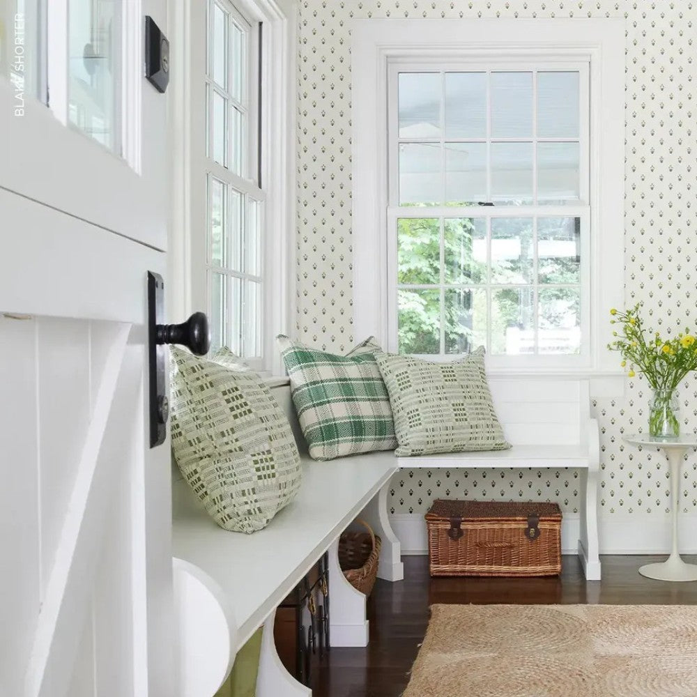
Most wallpaper regret comes down to scale. Not taste--scale. A large motif can look breathtaking across four walls, then feel awkward on one skinny wall next to a door casing. Schumacher's pattern families help you predict this before you buy: chinoiserie murals and scenic prints carry more visual weight; tight geometrics and small toiles read more like texture from across the room.
Trend reporting for 2026 points to wallpaper staying bold: strong color, big patterns, and more personality, plus wallpaper showing up on ceilings and cabinetry (2026 wallpaper trend reporting). Schumacher sits right in that lane because many of its best-known prints are designed to be the main event. If you like a more restrained look, use the same patterns in softer colorways or balance them with solids and warm neutrals.
Here's the practical way to choose:
- Small rooms (powder rooms, vestibules): dense repeats, small-to-mid scale motifs, or moody grounds that blur corners. Bold can work here because you're not asking the room to feel "calm."
- Medium rooms (bedrooms, offices): mid-scale prints that don't fight the headboard, drapery, or bookcases. Think "pattern you notice, then stop noticing."
- Large rooms (dining rooms, open living areas): large botanicals, dramatic chinoiserie, or statement stripes that can hold their own from 10-15 feet away.
Also: decide if you want the pattern to read from the hallway. If you do, pick higher contrast. If you don't, choose a lower-contrast colorway where the motif is closer to tone-on-tone.
Iconic Schumacher patterns: Chiang Mai Dragon, Cloud Toile, and Citrus Garden
Some patterns become classics because they photograph well. Schumacher's icons go further--they work in real life lighting, with real life clutter, and still look intentional. Three that come up again and again are Schumacher Chiang Mai Dragon, Cloud Toile, and Citrus Garden.
Chiang Mai Dragon is one of the most recognizable wallpapers in the design world for a reason. It's chinoiserie, but not fussy. The dragon and floral elements have movement, and the pattern has enough negative space to breathe. Colorway strategy matters here. If you want the print to feel modern cottage instead of formal, pair a softer ground with warm whites, natural wood, and nubby textiles. If you want drama, choose a deeper ground and keep your upholstery simple.
Cloud Toile is the "quietly obsessed" option. Toile can skew traditional, but Cloud Toile's mood is lighter and airier. It's a smart choice for bedrooms, stairwells, and rooms where you want pattern without a hard edge. Look for colorways that echo what you already own--blue with denim, green with olive or botanical art, neutrals with warm wood and brass.
Citrus Garden is joyful without reading childish. It works best when you let it lead: pick one or two colors from the print for paint, rugs, and textiles, and don't add competing patterns at the same scale. If you love the 2026 direction toward big botanicals and expressive rooms, this is an easy yes.
Materials and finish: paper vs texture (linen, grasscloth, sisal) and where they actually work
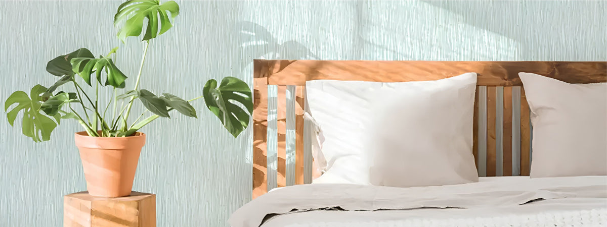
Texture is the reason wallpaper can feel warmer than paint. It catches light, hides minor wall imperfections, and adds that "human" dimension designers keep chasing. For 2026, textured surfaces like linen, grasscloth, and sisal are repeatedly called out as continuing to trend (designer expectations for wallpaper direction). Schumacher has plenty of options in that tactile category, alongside crisp printed papers and more graphic designs.
But texture is not a universal solution. Grasscloth and similar natural textures can be more vulnerable to moisture, scuffing, and oils from hands. They're gorgeous in dining rooms, primary bedrooms, formal living rooms, and offices--places where people don't brush the walls constantly. They're a tougher sell in tight hallways, kids' bathrooms, and behind a kitchen banquette where chairs scrape.
If you want the look of texture in a harder-working room, consider a smoother printed wallpaper in a woven look, or reserve the delicate texture for one protected wall. Wallpaper on a ceiling can also be magical, but it makes installation more demanding. Plan on a professional installer for anything with a noticeable repeat or a fragile surface.
One more coordination trick: Schumacher is also a major resource for Schumacher fabric. If your long-term plan includes drapery, a bench cushion, or dining chair upholstery, it's worth checking whether there's a coordinating fabric story before you commit to a wallcovering.
Schumacher wallpaper price: what to expect, what drives cost, and how to order smart
People ask about Schumacher wallpaper price early in the research process, and it's the right question. Schumacher is positioned in the premium/luxury category, and the total project cost is more than the roll price. You're paying for design, color work, and often more complex production--and you're also paying for the realities of wallpaper installation.
I'm not going to invent a per-roll number because pricing varies by pattern, ground, material, and retailer. What I will say is this: plan for a multi-part budget--samples, wallpaper yardage (with extra for repeat and waste), prep (wall smoothing matters), and installation. Retailers and pattern roundups that sell Schumacher samples reinforce that the buying process often starts with sampling and planning, not impulse checkout (retailer overview of popular Schumacher patterns).
Three things drive cost and quantity more than people expect:
- Repeat size: big repeats usually mean more waste to match the pattern cleanly.
- Room interruptions: lots of doors, windows, and built-ins increase cutting and waste.
- Material type: tactile and specialty surfaces can require more careful handling.
Order smart: get a sample, tape it up on more than one wall, and look at it morning and night. If you're going moody, check it under lamps. If you're going high contrast, check it from the doorway. Wallpaper is a long relationship.
Find It at A Cottage in the City
Schumacher is a trade-trusted name, and being able to shop it through an authorized retailer makes the process simpler--samples, pattern guidance, and the right amount ordered for your walls. You'll find Schumacher wallpaper in our wallpaper selection, chosen for rooms that need real personality.
How to use Schumacher in a 2026 home: modern cottage, moody palettes, and pattern-drenched rooms
The best 2026 rooms aren't sterile. They're layered: warm neutrals, moody color, texture you can feel, and at least one pattern with a point of view. Schumacher wallpaper fits naturally because so much of the catalog is built around print history--chinoiserie, botanicals, toiles, geometrics--reinterpreted for how we live now.
Pattern drenching (using multiple patterns across walls, textiles, and sometimes ceilings) works when you control two things: palette and scale. Pick one hero print, one supporting pattern, and one "rest" texture. Then repeat a color in at least three places. If you want help building that kind of palette, start with how to make a color palette for a room.
Moody color is also still strong--deep greens, chocolate browns, ruddy reds--especially when balanced with warm white trim and aged brass. Schumacher has plenty of patterns that do moody without feeling heavy because the linework keeps the wall active. If you're still deciding between farmhouse-leaning and French-leaning rooms, French country vs. farmhouse style is a helpful gut-check before you commit to a print that reads traditional.
And if you're trying to make a newer home feel like it has a past, wallpaper is one of the fastest ways. Pair it with a rug that can handle real life (kitchens, entries, hallways), and the room feels finished. For families and pet owners, a washable rug is often the practical counterbalance to a special wallcovering--see machine-washable rugs and how they hold up.
When you're ready to shop, you'll find Schumacher wallcoverings at A Cottage in the City's wallpaper collection. Sara brings in brands like Schumacher because they make rooms feel collected, not mass-produced.
Related shopping links (so your wallpaper doesn't have to do all the work)
- Shop all wallpaper
- Peel & stick wallpaper options
- Rugs to ground a patterned room
- Washable rugs for real-life traffic
- Lighting (the make-or-break for moody wallpaper)
- Wall mirrors that break up big pattern
Schumacher vs. lookalikes: what to check before you commit to a "similar" print
It's tempting to search for "similar to Schumacher" when you see a hero pattern. Sometimes that works. Often it doesn't, and the difference shows up after installation when the room feels flatter than you expected.
Here's what to compare, specifically:
- Color complexity: Schumacher prints often use layered tones that read richer in changing light. A cheaper lookalike can look harsh at night.
- Line quality: On icon patterns like Chiang Mai Dragon, crispness matters. Soft, blurry linework looks muddy on a whole wall.
- Ground material: If you loved the depth of a textured ground, a flat paper won't give you the same shadow and movement.
- Repeat and scale: Lookalikes may shrink the motif to reduce printing cost. That changes the entire feel of the room.
- Support ecosystem: Trade-oriented brands are designed to coordinate with fabrics and trims. That makes a room feel intentional over time, not just "done."
If budget is the deciding factor, consider using Schumacher strategically: a powder room, an entry, a dining room, or a single dramatic wall where it can shine. Then keep the rest of the house calmer with paint and texture. Vintage furniture and well-made textiles carry the story, too--see the evolution and resurgence of vintage furniture trends if you're building that collected look room by room.
Is Schumacher wallpaper hard to buy if I don't have a designer?
It can be, depending on the pattern and how the brand is distributed. Schumacher has a strong trade-first presence, which is part of why designers trust it. The simplest path as a homeowner is ordering through an authorized retailer who can help with sampling, calculating quantity for repeats, and choosing the right material for your room. That support matters most when you're using a large-scale print or a delicate texture where mistakes get expensive.
What makes Schumacher Chiang Mai Dragon so popular?
Chiang Mai Dragon hits the sweet spot between statement-making and livable. The motif has movement and personality, but it isn't so dense that it turns into visual noise. It also comes in multiple colorways, so you can push it dramatic (deeper grounds) or make it feel lighter and more modern cottage (softer grounds, warm whites, natural textures). It's one of those patterns that looks intentional in a powder room and equally correct across a full dining room.
How do I choose between a bold Schumacher print and a textured wallcovering?
Decide what you want to notice first. Bold prints are about story and focal point--great for dining rooms, entries, and powder rooms. Textured wallcoverings (linen, grasscloth, sisal) are about depth and softness, and they tend to make a room feel warmer without shouting. In high-touch areas like narrow hallways or near seating where people brush the wall, smoother papers are usually easier to live with than delicate natural textures.
Why do Schumacher wallpaper prices feel higher than other brands?
Schumacher sits in the premium/luxury category, and the cost reflects design, coloration, and often more complex production than mass-market wallcoverings. The total project cost also includes sampling, ordering extra for repeat matching and waste, wall prep, and professional installation. If you're comparing options, compare the full installed result: a less expensive paper with a simpler print can still be a great choice, but it may not deliver the same depth of color or crispness of linework.
Can I use Schumacher wallpaper in a bathroom or kitchen?
Yes, but choose the material thoughtfully. Bathrooms and kitchens have moisture, temperature swings, and more wipe-down moments. Smoother papers and finishes are generally easier to maintain than delicate grasscloth-type textures, especially near sinks and high-splash areas. In a powder room with good ventilation, many homeowners successfully use bolder patterns because the room is small and the impact is huge. For kitchens, consider using wallpaper away from direct water exposure or on a ceiling.
Conclusion: Schumacher wallpaper is expensive to do twice, which is why planning matters. Pick your pattern job, get samples, check scale, and be honest about how your room gets used. If you want a room with personality that still feels grown-up, Schumacher's icons--Chiang Mai Dragon, Cloud Toile, Citrus Garden--are popular for good reason.
For more home decor inspiration and guides, visit the A Cottage in the City blog.


Leave a comment
This site is protected by hCaptcha and the hCaptcha Privacy Policy and Terms of Service apply.